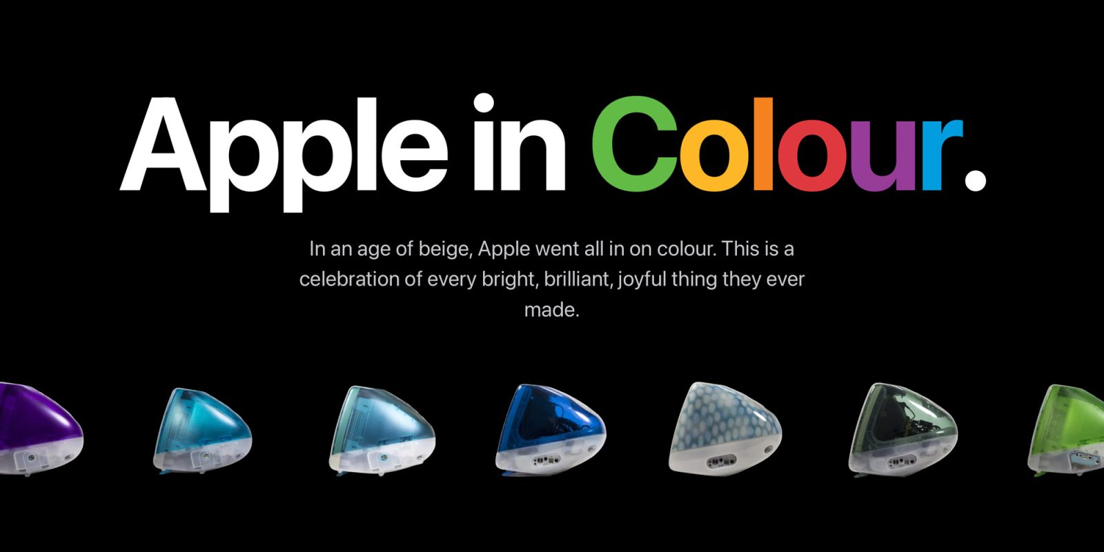
Apple's approach to hardware design has always placed a strong emphasis on color, from vibrant early computer releases to the sleek, premium finishes found across modern iPhone lineups. A newly launched website now allows tech enthusiasts to explore nearly 30 years of these color choices throughout the company's product history.
The interactive platform highlights the broad spectrum of shades Apple has adopted over the decades. Visitors can browse through various eras to see how design trends shifted from bold, playful hues to the sophisticated matte, metallic, and pastel tones seen on flagship smartphones and accessories.
For iPhone fans and design enthusiasts alike, the archive offers a nostalgic look at how device aesthetics have evolved. It serves as a visual timeline celebrating the creative finishes that have helped define consumer technology over the past generation.
For full details and to explore the interactive archive yourself, check the original coverage on 9to5Mac.